这几天看到一个面试题:
已知高度,完成一个三栏布局,左侧200px,右侧200px,中间自适应。
题目看起来不难,第一时间能想起来三种方案:Float、Absolute和Flex,后来发现还有两种:Table和Grid,所以来记录下。
首先写下公共的CSS样式:
1
2
3
4
5
6
7
8
9
10
11
12
13
14
15
16
17
18
19
20
21
22
23
24
25
26
| html * {
margin: 0;
padding: 0;
}
.left {
background: red;
width: 200px;
}
.center {
background: yellow;
}
.right {
background: blue;
width: 200px;
}
.container {
min-height: 100px;
margin: 20px;
width: 100%;
}
.left-center-right {
min-height: 100px;
}
.left-center-right>div {
min-height: 100px;
}
|
下面来写下五种写法:
1. Float
兼容性好,但是会影响文档流
1
2
3
4
5
6
7
8
9
10
11
12
| <section class="container float">
<div class="left-center-right">
<div class="left"></div>
<div class="right"></div>
<div class="center">
<h2>Float</h2>
<p>中间部分</p>
<p>中间部分</p>
<p>中间部分</p>
</div>
</div>
</section>
|
1
2
3
4
5
6
| .container.float .left {
float: left;
}
.container.float .right {
float: right;
}
|
2. Absolute
兼容性好,但是会影响文档流
1
2
3
4
5
6
7
8
9
10
11
12
| <section class="container absolute">
<div class="left-center-right">
<div class="left"></div>
<div class="right"></div>
<div class="center">
<h2>Absolute</h2>
<p>中间部分</p>
<p>中间部分</p>
<p>中间部分</p>
</div>
</div>
</section>
|
1
2
3
4
5
6
7
8
9
10
11
12
13
14
15
16
| .container.absolute {
position: relative;
}
.container.absolute .left {
position: absolute;
left: 0;
}
.container.absolute .center {
position: absolute;
left: 200px;
right: 200px;
}
.container.absolute .right {
position: absolute;
right: 0;
}
|
3. Table
兼容性好,但是比较老旧,布局比较麻烦,已经很少见
1
2
3
4
5
6
7
8
9
10
11
12
| <section class="container table">
<div class="left-center-right">
<div class="left"></div>
<div class="center">
<h2>Table</h2>
<p>中间部分</p>
<p>中间部分</p>
<p>中间部分</p>
</div>
<div class="right"></div>
</div>
</section>
|
1
2
3
4
5
6
7
8
9
10
11
12
13
| .container.table .left-center-right {
display: table;
width: 100%;
}
.container.table .left {
display: table-cell;
}
.container.table .center {
display: table-cell;
}
.container.table .right {
display: table-cell;
}
|
4. Flex
兼容性较好,在移动端很常用,写法简单。
1
2
3
4
5
6
7
8
9
10
11
12
| <section class="container flex">
<div class="left-center-right">
<div class="left"></div>
<div class="center">
<h2>Flex</h2>
<p>中间部分</p>
<p>中间部分</p>
<p>中间部分</p>
</div>
<div class="right"></div>
</div>
</section>
|
1
2
3
4
5
6
| .container.flex .left-center-right {
display: flex;
}
.container.flex .center {
flex: 1;
}
|
5. Grid
兼容性不是很好,但是写法最为简单。
1
2
3
4
5
6
7
8
9
10
11
12
| <section class="container grid">
<div class="left-center-right">
<div class="left"></div>
<div class="center">
<h2>Grid</h2>
<p>中间部分</p>
<p>中间部分</p>
<p>中间部分</p>
</div>
<div class="right"></div>
</div>
</section>
|
1
2
3
4
5
| .container.grid .left-center-right {
display: grid;
grid-template-rows: 100px;
grid-template-columns: 200px 1fr 200px;
}
|
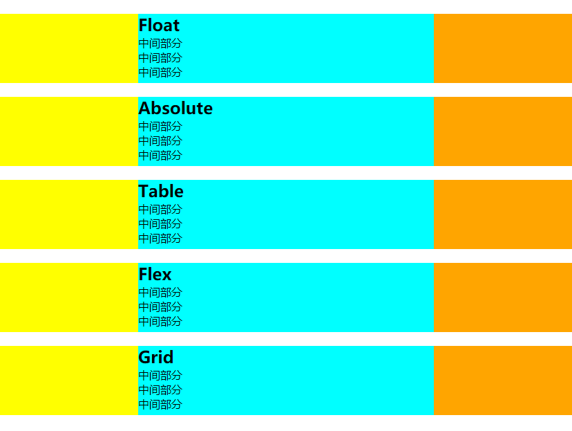
最后,如果题目修改,高度未定的时候,这五种布局还都能成功么?
经过测试,增加中间div的内容使之超出div的高度
1
2
3
4
5
6
7
8
9
| <div class="center">
<h2>Grid</h2>
<p>中间部分</p>
<p>中间部分</p>
<p>中间部分</p>
<p>中间部分</p>
<p>中间部分</p>
<p>中间部分</p>
</div>
|
对比下结果:
正常情况:
添加内容后:
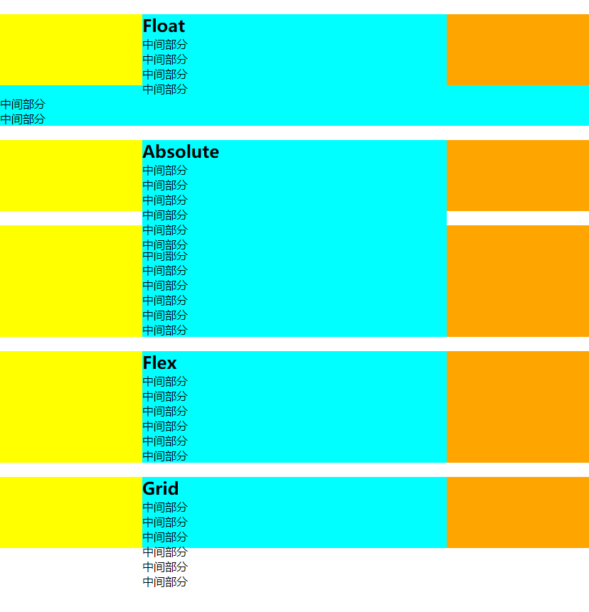
可以看出:
- Table和Flex布局能正常撑开容器高度,未知高度情况下可以考虑这两个方案
- Float布局中间div高度变高,超出部分被宽度会和left-center-right一样,文字从最左边开始
- Absolute布局会只撑开中间div的高度
- Grid容器和div高度不会改变,但是因为grid-template-rows的设定,文字会超出容器